2010/12/29

Goals are important to have in life. They are especially important for website design, because without any goals, you have nothing to shoot for in the end and nothing to measure your success by. Goals help designers focus on the important things and not lose sight of what you want in the end; goals are what help designers deliver outstanding sites every time.
The results at the end of the site design process are usually pretty much the same with every project; I end up with a site design and I hand it off to the client. In the beginning, I have an idea of what I want to do and what the client needs, and I know I want to strive for an awesome deliverable in the end. The steps in between follow roughly the same path, however each site design is vastly different in style and character needing some different steps to achieve the proposed outcome. Sometimes I feel the need to sketch and other times I jump right on my computer. Even though the process may be different each time, it’s important to have goals with every site, whether you write them down or keep them in the back of your mind while you design. I’ve compiled a list of 5 goals that are important to think about each time you start a site design.

1. Strive for a design that’s user-friendly and beautiful.
A great user-interface is often sacrificed for a wonderful design, but both are equally important and should go hand in hand. A well-designed site helps users travel through your site with ease. Items are where users expect them to be. If they’re in unusual places, they need to make sense and the site design needs to direct users where to go. The navigation is best near the top of the page not because that’s where it looks best, but because users don’t often know to scroll down to find it. If you expect users to scroll to find the navigation, give them a reason to scroll like some movement in the design that directs their eye downward and they’ll find it more easily.
Case: http://www.whitehouse.gov/

The White House website was redesigned around the time that President Barack Obama took office in November of 2008. The old site focused on delivering information, but it didn’t seem to care how organized the information was or how the site design was incorporated to improve usability. The new site is both user-friendly and beautiful, illustrating how the site design aids usability. Soft gradients and classic architectural-inspired patterns grace the new style, creating a softer, more modern appearance. Information is organized logically and the new navigation helps users find what they need quickly and efficiently. Information is easier to find and read with the spacious layout, which also helps users navigate through the site. Unnecessary items were taken out and all that’s left are the important items for users.
2. Create a site that targets the appropriate audience.
I’ve seen many gorgeous sites that just don’t fit the target audience. A retro site with funky colors may look great for a design studio or a music producer, and your client may love the look, but it doesn’t fit a law office with a professional, corporate clientele. Your client can give you good insight on their particular audience, who they target and what customers they reach the most. Do your research and see what other similar companies are doing. You don’t have to do the same thing, but the feel your site gives to its users should be similar.
Case: http://www.apple.com/
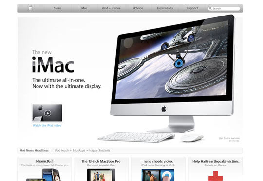
Apple’s site is a great example of a site with an awesome design that targets the appropriate audience. They showcase a clean minimal userface with soft gradients and large bold images. Typography is important, as Apple shows they put careful thought into headlines, sizes and placement of text. This modern style accurately targets a trendy young technology-focused audience. The site also has a bit of fun and isn’t completely serious, which falls right in step with who their audience is. The design also matches their products, echoing the sleek look, rounded corners, and clean organization. This helps customers feel comfortable on the site, and creates a great cohesive look to all their branding materials.
3. Design a user-interface that flows freely, allowing users to navigate easily and find what they need quickly and efficiently.
A good navigation is key for a top notch site. A sitemap done beforehand helps determine where pages should go and what items should be placed together. Many sites often have too large of a navigation because they didn’t plan where information would fit best. You need to minimize the amount of space and maximize the amount of pertinent information. Not everything belongs on a company’s website because not everyone is going to have the patience to read it. Streamline the navigation, determine what’s important and throw away the rest.
Case: http://www.mediatemple.net/
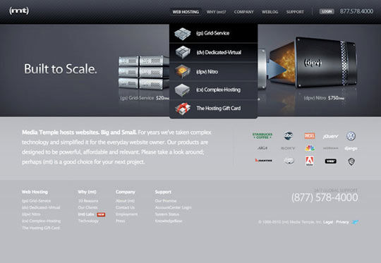
Media Temple’s site design is sophisticated and very smooth with dark gradients and a technology-focused appearance. Their easy-to-use top navigation includes illustrations to help users find what they are looking for. The site design is free of clutter and pages are wide and spacious, making it easy to read and navigate. After clicking on introductory pages, bright learn more buttons direct users deeper into the site and eventually lead to their sales pages, which is where Media Temple hopes you’ll land. Users are assisted through the whole process with matching buttons and helpful guides that are easy to follow.
4. Give the client what they want plus what they need.
As many designers know, the client usually thinks they know best. They do know their company better than you (in most cases!) so do take their advice on their industry, listen to what they say about their audience and the products they are selling. However, they may not know how to organize the information in the most practical manner, and they may not realize the characteristics of web users. Educate your clients on items that are important for them to know and help them understand why they don’t need certain things that may seem cool, like a 5 minute flashy intro to their site.
Case: http://mobify.me/
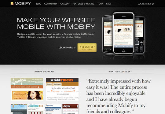
Mobify’s site is clean and modern with a minimalism design and great visual details that aid users surfing their site. The site is targeted toward companies as well as developers and designers wanting mobile-friendly sites. People coming to this site are probably already very web-saavy and hoping to extend the functionality of their own site. The site design is everything that a company selling mobile services needs. The interface is minimal and smooth, with a similar feel to that of a mobile device. The navigation is clean and easy-to-use, giving users what they need on this modern and technology-focused site.
5. Increase the site functionality with additional code.
A simple website can be made into a great website with the addition of some fancy features with the use of javascript or php. Users will enjoy the extra added feature and it gives designers a chance to try out a new tutorial. There are so many skills out there to learn and add to your repertoire, why not aim to stretch your design legs and try something new with each site? Try a new jquery tutorial or add a fun php script. There are tons of new things to learn every time you sit down to design a site. If you could learn just one new thing with every site, think of where you could be in one years time.
Case: http://www.authenticjobs.com/
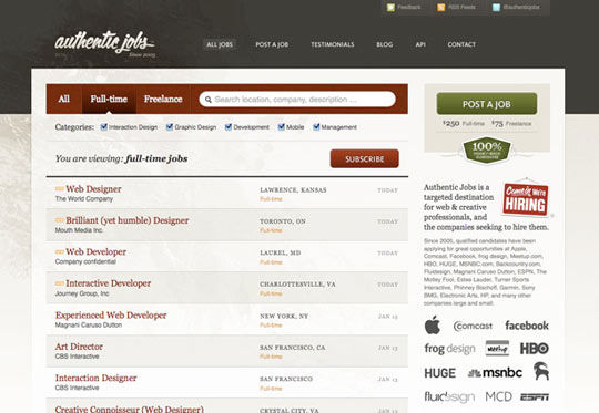
Authentic Jobs does a nice job of incorporating details into the site that increase the usability and functionality. The site could have been more basic and served a similar purpose, but some javascript was added that significantly increased the value of the site and makes it more fun for users. You can change types of jobs and add or delete categories to help filter through their list of jobs with the click of a button, making it easy to find exactly what you’re looking for in less time. These types of details really make a site shine.
Goals are definitely an important part of being a designer and moving forward with your design and coding skills. You can’t hope to increase your skills and dazzle your clients if you don’t aim for something. Think of what you want to accomplish when you start a new site and aim not for perfection but for a great site design, each and every time. What are your goals when you sit down to design a site? Share your thoughts and comments below.
Original article link:http://webdesignledger.com/tips/five-goals-to-strive-for-with-every-site-you-design


